> For the complete documentation index, see [llms.txt](https://paypal.gitbook.com/llms.txt). Markdown versions of documentation pages are available by appending `.md` to page URLs; this page is available as [Markdown](https://paypal.gitbook.com/online-payments/checkout/javascript-sdk-reference.md).
# JavaScript SDK Reference
The PayPal JavaScript SDK dynamically exposes objects and methods based on the components you select. Add components to your `
```
The JavaScript SDK supports the following components:
* [buttons](#buttons) (default)
* [marks](#marks)
* [card-fields](#card-fields)
* [funding-eligibility](#funding-eligibility)
* [messages](#messages)
{% hint style="warning" %}
**Important:** This is version 2 of the JavaScript SDK reference guide. [Version 1](https://developer.paypal.com/sdk/js/v1/reference/) is a legacy integration.
{% endhint %}
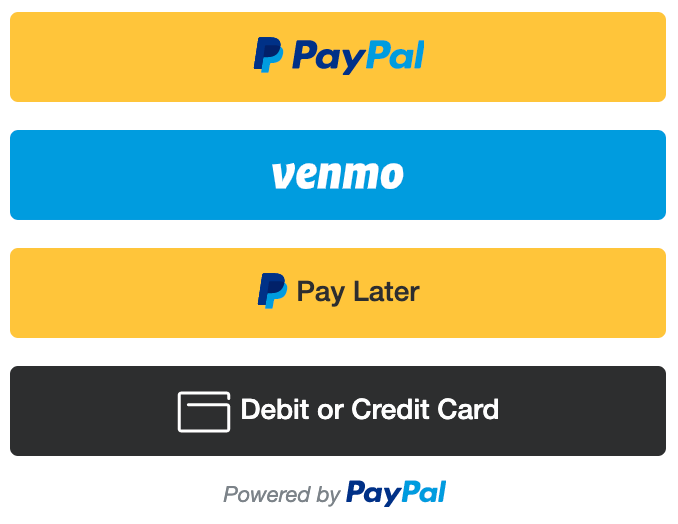
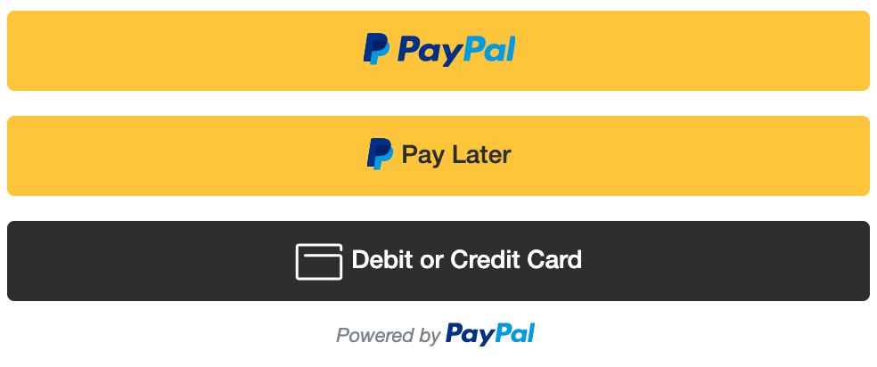
## Buttons
The payment buttons component automatically shows all eligible buttons in a single location on your page. See the standard payments integration.
{% tabs %}
{% tab title="Vanilla JS" %}
```html
```
{% endtab %}
{% tab title="React (JS)" %}
```javascript
import { PayPalScriptProvider, PayPalButtons } from "@paypal/react-paypal-js";
export default function App() {
const initialOptions = {
clientId: "YOUR_CLIENT_ID",
// Add other options as needed
};
return (
);
}
```
{% endtab %}
{% tab title="ES Module" %}
```javascript
import { loadScript } from "@paypal/paypal-js";
let paypal;
try {
paypal = await loadScript({ clientId: "YOUR_CLIENT_ID" });
} catch (error) {
console.error("failed to load the PayPal JS SDK script", error);
}
if (paypal) {
try {
await paypal.Buttons({
style: {
layout: 'vertical',
color: 'blue',
shape: 'rect',
label: 'paypal'
}
}).render("#paypal-button-container");
} catch (error) {
console.error("failed to render the PayPal Buttons", error);
}
}
```
{% endtab %}
{% endtabs %}
#### Layout
Set the `style.layout` option to determine how the buttons show up when multiple buttons are available:
| Value | Description | Layout |
| ------------ | -------------------------------------------------------------------------------------------------------------------------------------------------------------------------------------------------------------------------------------------------------------------------------- | ---------------------------------------------------------------------------------------------------------------------------------------------------------------------------------------------------------------------------------------------------------------------------------------------------------------------------------------------------------- |
| `vertical` |
Default. Buttons are stacked vertically with a maximum of 6 buttons. Recommended when:
Presenting a dynamic list of payment options on checkout and shopping cart pages.
Leveraging Checkout as a full-stack payments platform.
|
Mobile
Venmo is available on mobile in US markets only.
Web
|
| `horizontal` |
Buttons are stacked horizontally with a maximum of 2 buttons. Recommended when:
Placing buttons on a product page, next to the product.
Space on the page is limited.
Alternative payment options are already provided.
|
Mobile
Venmo is available on mobile in US markets only.
Web
|
**Which buttons will I see?**
The buttons that show up are decided automatically, based on a range of factors, including:
* Buyer country
* Device type
* Funding sources the buyer has opted to see
As a result, each buyer sees a unique combination of buttons. Pay Later offers differ by country and have different buttons. To prevent certain buttons from showing up, see [Disable funding](https://developer.paypal.com/sdk/js/configuration/#disable-funding) in the JavaScript SDK reference.
#### Color
Set the style.color option to 1 of these values:
| Value | Description | Button |
| ------------------------ | --------------------------------------------------------------------------------------------------------------------------------------------------------------------------------------------------------------------------------------------------------------------------------------------------------------------------------- | -------------------------------- |
| `gold` |
Recommended
People around the world know us for the color gold and research confirms it. Extensive testing determined just the right shade and shape that help increase conversion. Use it on your website to leverage PayPal’s recognition and preference.
|  |
| `blue` |
First alternative
If gold doesn't work for your site, try the PayPal blue button. Research shows that people know it is our brand color, which provides a halo of trust and security to your experience.
If gold or blue doesn't work for your site design or aesthetic, try the silver, white, or black buttons. Because these colors are less capable of drawing people’s attention, we recommend these button colors as a second alternative.
|  |
#### Shape
Set the `style.shape` option to 1 of these values:
| Value | Description | Button |
| ------- | ------------------------------------------------------------------- | -------------------------------- |
| `rect` |
Recommended
The default button shape.
|  |
| `pill` | Rounds the sides of the button. |  |
| `sharp` | Gives the button sharp corners. |  |
#### **Border radius**
`style.borderRadius` is used to define a custom border radius of the buttons.
To define the border radius of the buttons, set the style.borderRadius option to a number that is greater than or equal to 0 .
{% hint style="info" %}
#### **Note**
If `style.borderRadius` and `style.shape` are both defined, `style.borderRadius` will take priority.
{% endhint %}
{% tabs %}
{% tab title="Vanilla JS" %}
```javascript
paypal.Buttons({
style: {
borderRadius: 10,
}
}).render('#paypal-button-container');
```
{% endtab %}
{% tab title="React (JS)" %}
```javascript
import { PayPalScriptProvider, PayPalButtons } from "@paypal/react-paypal-js";
export default function App() {
const initialOptions = {
clientId: "YOUR_CLIENT_ID",
};
const styles = {
borderRadius: 10,
};
return (
);
}
```
{% endtab %}
{% tab title="ES Module" %}
```javascript
import { loadScript } from "@paypal/paypal-js";
let paypal;
try {
paypal = await loadScript({ clientId: "YOUR_CLIENT_ID" });
} catch (error) {
console.error("failed to load the PayPal JS SDK script", error);
}
if (paypal) {
try {
await paypal.Buttons({
style: {
borderRadius: 10,
}
}).render("#paypal-button-container");
} catch (error) {
console.error("failed to render the PayPal Buttons", error);
}
}
```
{% endtab %}
{% endtabs %}
#### **Size**
* The button adapts to the size of its container element by default.
* Your button container element needs to be wide enough for your horizontal payment buttons.
#### **Height**
To customize the button height, set the `style.height` option to a value from `25` to `55`. The button has a default maximum height of 55px. Remove this limitation and set the button height to fill its parent container:
1. Set `style.disableMaxHeight` to `true`.
2. Select a valid funding source: `fundingSource: 'paypal' | 'venmo' | 'paylater' | 'credit'`
3. Change the `height` value at the parent container level.
{% hint style="info" %}
If `style.disableMaxHeight` and `style.height` are both defined on the PayPal button, an error will be thrown and the button will not render. You must choose one or the other.
{% endhint %}
{% tabs %}
{% tab title="Vanilla JS" %}
```javascript
paypal.Buttons({
style: {
disableMaxHeight: true,
}
}).render('#paypal-button-container');
```
{% endtab %}
{% tab title="React (JS)" %}
```javascript
import { PayPalScriptProvider, PayPalButtons } from "@paypal/react-paypal-js";
export default function App() {
const initialOptions = {
clientId: "YOUR_CLIENT_ID",
};
const styles = {
disableMaxHeight: true,
};
return (
);
}
```
{% endtab %}
{% tab title="ES Module" %}
```javascript
import { loadScript } from "@paypal/paypal-js";
let paypal;
try {
paypal = await loadScript({ clientId: "YOUR_CLIENT_ID" });
} catch (error) {
console.error("failed to load the PayPal JS SDK script", error);
}
if (paypal) {
try {
await paypal.Buttons({
style: {
disableMaxWidth: true,
}
}).render("#paypal-button-container");
} catch (error) {
console.error("failed to render the PayPal Buttons", error);
}
}
```
{% endtab %}
{% endtabs %}
#### **Label**
Set the `style.label` option to 1 of these values:
| Value | Description | Button |
| ------------- | -------------------------------------------------------------------------------------------------------------------------------------------------------------------------------------------------------------------------------------------------------------------------------------------------------------------------------------------------------------------------------------------------------------------------------------------------------------------------------------------------------------------------------------------------------------- | -------------------------------- |
| `paypal` | **Recommended** The default option. Shows the PayPal logo. |  |
| `checkout` | Shows the Checkout button. |  |
| `buynow` | Shows the PayPal Buy Now button and initializes the checkout flow. |  |
| `pay` | Shows the Pay With PayPal button and initializes the checkout flow. |  |
| `installment` |
Shows the PayPal installment button and offers a specified number of payments during a payment installment period.
The installment feature is available only in MX and BR.
Set style.period to set the number of payments during the installment period:
BR: 2, 3, 4, 5, 6, 7, 8, 9, 10, 11, 12
en\_MX, MX: 3, 6, 9, 12
|  |
#### **Tagline**
Set the `style.tagline` to `false` to disable the tagline text:
{% hint style="info" %}
Set the style.layout to horizontal for taglines. If using the message option it will replace the tagline.
{% endhint %}
| Value | Description | Button |
| ------- | -------------------------------------------------------------------- | :--------------------------------------------------------------------------------------------------------------------------------------------------------------------------: |
| `true` |
Recommended
Show tagline text Default.
|
Two easy ways to pay
|
| `false` | Disable tagline text. |
|
### Message
Customize the message with your buttons using the `message` option.
```javascript
paypal.Buttons({
message: {
amount: 100,
align: 'center',
color: 'black',
position: 'top',
}
}).render('#paypal-button-container');
```
#### **Amount**
Set the `message.amount` option to show the most relevant offer and price breakdown to your customers.
To define the amount of the message, set the `message.amount` option to a number that is greater than `0` . This value should reflect the current product or cart value that will be used once a checkout session has started.
| Value | Description | Message |
| ----------- | ----------------------------------------------------------------------------- | ------- |
| `undefined` | **Default**. When no amount value is provided a generic message is shown. | |
| `100` | An example qualifying amount for Pay in 4 with a weekly amount breakdown. | |
| `2000` | An example qualifying amount for Pay Monthly with a monthly amount breakdown. | |
#### **Align**
Set the `message.align` option to align the message content to the buttons.
| Value | Description | Message |
| -------- | -------------------------------------------------------------------- | ------- |
| `center` | **Default**. Aligned in the center between the edges of the buttons. | |
| `left` | Aligned to the left edge of the buttons. | |
| `right` | Aligned to the right edge of the buttons. | |
#### **Color**
Set the `message.color` option to change the message color from `black` or `white` depending your website background so the message is visible.
| Value | Description | Message |
| ------- | ---------------------------------------------------------------------- | ------- |
| `black` | **Default**. Black text with a colored PayPal logo and blue link text. | |
| `white` | White text with a white PayPal logo and white link text. | |
#### **Position**
Set the `message.position` option to place the message above or below the buttons.
| Value | Description | Message |
| -------- | --------------------------------------------------------------------------------------------------------------------------------------------------------------------------------------------------------------------------------------------------- | ------- |
| `top` | Position the message above the buttons. | |
| `bottom` |
Default . Position the message below the buttons.
Note: When the Debit/Credit Card button is present as part of your button stack only top is supported and will be the default value.
| |
#### displayOnly
The `displayOnly` parameter determines the payment methods your customers see. By default, buyers see all eligible payment methods. Options passed to `displayOnly` are applied in order from left to right.
We have the following options available:
| Value | Description |
| ----------- | -------------------------------------------------------------------------------------------------------------------------------------------------------------------------------------------------------------------------------- |
| `vaultable` | Display only the [payment methods that support save](https://developer.paypal.com/docs/checkout/save-payment-methods/). Your integration, merchant settings, and customer location determine which payment methods can be saved. |
{% tabs %}
{% tab title="Vanilla JS" %}
```javascript
paypal.Buttons({
displayOnly: ["vaultable"]
}).render('#paypal-button-container');
```
{% endtab %}
{% tab title="React (JS)" %}
```javascript
import { PayPalScriptProvider, PayPalButtons } from "@paypal/react-paypal-js";
export default function App() {
const initialOptions = {
clientId: "YOUR_CLIENT_ID",
};
const displayOnly = ["vaultable"];
return (
);
}
```
{% endtab %}
{% tab title="ES Module" %}
```javascript
import { loadScript } from "@paypal/paypal-js";
let paypal;
try {
paypal = await loadScript({ clientId: "YOUR_CLIENT_ID" });
} catch (error) {
console.error("failed to load the PayPal JS SDK script", error);
}
if (paypal) {
try {
await paypal.Buttons({
async createOrder() {
try {
const response = await fetch("/my-server/create-paypal-order", {
method: "POST",
headers: { "Content-Type": "application/json" },
body: JSON.stringify({
cart: [{ id: "YOUR_PRODUCT_ID", quantity: "YOUR_PRODUCT_QUANTITY" }],
}),
});
const orderData = await response.json();
if (!orderData.id) {
const errorDetail = orderData.details[0];
const errorMessage = errorDetail
? `${errorDetail.issue} ${errorDetail.description} (${orderData.debug_id})`
: "Unexpected error occurred, please try again.";
throw new Error(errorMessage);
}
return orderData.id;
} catch (error) {
console.error(error);
throw error;
}
}
}).render("#paypal-button-container");
} catch (error) {
console.error("failed to render the PayPal Buttons", error);
}
}
```
{% endtab %}
{% endtabs %}
Server (Node.js)
```javascript
app.post("/my-server/create-paypal-order", async (req, res) => {
const order = await createOrder();
res.json(order);
});
// use the orders api to create an order
function createOrder() {
// create accessToken using your clientID and clientSecret
// for the full stack example, please see the Standard Integration guide
// https://developer.paypal.com/docs/multiparty/checkout/standard/integrate/
const accessToken = "REPLACE_WITH_YOUR_ACCESS_TOKEN";
return fetch ("https://api-m.sandbox.paypal.com/v2/checkout/orders", {
method: "POST",
headers: {
"Content-Type": "application/json",
Authorization: `Bearer ${accessToken}`,
}
body: JSON.stringify({
"purchase_units": [
{
"amount": {
"currency_code": "USD",
"value": "100.00"
},
"reference_id": "d9f80740-38f0-11e8-b467-0ed5f89f718b"
}
],
"intent": "CAPTURE",
"payment_source": {
"paypal": {
"experience_context": {
"payment_method_preference": "IMMEDIATE_PAYMENT_REQUIRED",
"payment_method_selected": "PAYPAL",
"brand_name": "EXAMPLE INC",
"locale": "en-US",
"landing_page": "LOGIN",
"shipping_preference": "GET_FROM_FILE",
"user_action": "PAY_NOW",
"return_url": "https://example.com/returnUrl",
"cancel_url": "https://example.com/cancelUrl"
}
}
}
})
})
.then((response) => response.json());
}
```
Orders v2 API options
* `intent`: The intent to either capture the payment immediately or authorize a payment for an order after order creation. The values are:
* `CAPTURE`: **Default**. The merchant intends to capture payment immediately after the customer makes a payment.
* `AUTHORIZE`: The merchant intends to authorize a payment and place funds on hold after the customer makes a payment. Authorized payments are guaranteed for up to 3 days but are available to capture for up to 29 days. After the 3-day honor period, the original authorized payment expires and you need to re-authorize the payment. You need to make a separate request to capture payments on demand. This intent isn't supported when you have more than 1 `purchase_unit` within your order.
See [authorize a payment and capture funds later](https://developer.paypal.com/docs/checkout/standard/customize/authorization/).
* `purchase_units`: **Required**. An array of purchase units. Each purchase unit establishes a contract between a payer and the payee. Each purchase unit represents either a full or partial order that the payer intends to purchase from the payee. See [purchase unit request object definition](https://developer.paypal.com/docs/api/orders/v2/#definition-model-update_purchase_unit_request) for additional information.
* `payment_source`: Optionally define the `payment_source` when creating the order. This payment source can be `paypal`, a vault `token`, `card` information for PCI-compliant merchants, or alternative payment methods such as `blik` and `apple_pay`. For more information, see [Orders v2 API](https://developer.paypal.com/docs/api/orders/v2/#orders_create) and [payment\_source](https://developer.paypal.com/docs/api/orders/v2/#definition-payment_source).
### createSubscription
Provides a simplified and secure subscription experience. PayPal presents payment types to your buyers automatically, making it easier for them to complete their purchase using methods such as Pay with Venmo, PayPal Credit, and credit card payments without reintegration as they are made available.
Pass `vault=true` and `intent=subscription` in the JavaScript SDK to set up a subscription, rather than a one-time transaction.
{% tabs %}
{% tab title="Vanilla JS" %}
```javascript
```
{% endtab %}
{% tab title="React (JS)" %}
```javascript
import { PayPalScriptProvider, PayPalButtons } from "@paypal/react-paypal-js";
export default function App() {
const initialOptions = {
clientId: "YOUR_CLIENT_ID",
vault: true,
intent: "subscription",
};
return (
);
}
```
{% endtab %}
{% tab title="ES Module" %}
```javascript
import { loadScript } from "@paypal/paypal-js";
let paypal;
try {
paypal = await loadScript({
clientId: "YOUR_CLIENT_ID",
vault: true,
intent: "subscription"
});
} catch (error) {
console.error("failed to load the PayPal JS SDK script", error);
}
if (paypal) {
try {
await paypal.Buttons().render("#paypal-button-container");
} catch (error) {
console.error("failed to render the PayPal Buttons", error);
}
}
```
{% endtab %}
{% endtabs %}
Finally, implement the `createSubscription` function that's called when the buyer selects the PayPal button.
#### Actions
* **create** — Creates a subscription for your plan and includes the plan ID, subscriber details, shipping, and other details. The `plan_id` needs to belong to the client-id configured on the script.\
\
`actions.subscription.create` options: See the [create subscription](https://developer.paypal.com/docs/api/subscriptions/v1/#subscriptions_create) endpoint for supported options defined in the request body. Also see [create a payment button for the subscription](https://developer.paypal.com/docs/subscriptions/integrate/#3-create-payment-button) for more examples.
{% tabs %}
{% tab title="Vanilla JS" %}
```javascript
paypal.Buttons({
createSubscription(data, actions) {
return actions.subscription.create({
"plan_id": "YOUR_PLAN_ID"
});
},
onApprove(data) {
alert(`You have successfully created subscription ${data.subscriptionID}`);
}
}).render("#paypal-button-container");
```
{% endtab %}
{% tab title="React (JS)" %}
```javascript
import { PayPalButtons, PayPalScriptProvider } from "@paypal/react-paypal-js";
export default function App() {
const initialOptions = {
clientId: "YOUR_CLIENT_ID",
vault: true,
intent: "subscription"
};
const createSubscription = (data, actions) => {
return actions.subscription.create({
"plan_id": "YOUR_PLAN_ID"
});
};
const onApprove = (data) => {
alert(`You have successfully subscribed to ${data.subscriptionID}`);
};
return (
);
}
```
{% endtab %}
{% tab title="ES Module" %}
```javascript
import { loadScript } from "@paypal/paypal-js";
let paypal;
try {
paypal = await loadScript({
clientId: "YOUR_CLIENT_ID",
});
} catch (error) {
console.error("failed to load the PayPal JS SDK script", error);
}
if (paypal) {
try {
await paypal.Buttons({
onError(error) {
window.location.assign("/your-error-page-here");
}
}).render("#paypal-button-container");
} catch (error) {
console.error("failed to render the PayPal Buttons", error);
}
}
```
{% endtab %}
{% endtabs %}
{% hint style="info" %}
**Note:** This error handler is a catch-all. Errors at this point aren't expected to be handled beyond showing a generic error message or page.
{% endhint %}
### onInit / onClick
Called when the button first renders. You can use it for validations on your page if you are unable to do so prior to rendering. For example, enable buttons when form validation passes or disable if it fails.
#### **Data attributes**
* `fundingSource`: The funding source of the button that was selected. See the funding sources in the [standalone buttons](https://developer.paypal.com/docs/checkout/standard/customize/standalone-buttons/) guide.
{% tabs %}
{% tab title="Vanilla JS" %}
```html
);
}
```
{% endtab %}
{% tab title="ES Module" %}
```javascript
import { loadScript } from "@paypal/paypal-js";
let paypal;
const checkbox = document.querySelector("#check");
const errorMessage = document.querySelector("#error");
try {
paypal = await loadScript({ clientId: "YOUR_CLIENT_ID" });
} catch (error) {
console.error("failed to load the PayPal JS SDK script", error);
}
if (paypal) {
try {
await paypal.Buttons({
onInit(data, actions) {
actions.disable();
checkbox.addEventListener("change", function (event) {
if (event.target.checked) {
actions.enable();
} else {
actions.disable();
}
});
},
onClick() {
if (!checkbox.checked) {
errorMessage.classList.remove("hidden");
}
},
}).render("#paypal-button-container");
} catch (error) {
console.error("failed to render the PayPal Buttons", error);
}
}
```
{% endtab %}
{% endtabs %}
For cases when you need asynchronous validation, see asynchronous validation.
### paypal.Buttons().isEligible()
Commonly used for [standalone buttons](https://developer.paypal.com/docs/checkout/standard/customize/standalone-buttons/) when you need to check if the funding source is eligible.
{% tabs %}
{% tab title="Vanilla JS" %}
```javascript
paypal.getFundingSources().forEach(function(fundingSource) {
const button = paypal.Buttons({
fundingSource: fundingSource
});
if (button.isEligible()) {
button.render('#paypal-button-container');
}
});
```
{% endtab %}
{% tab title="ES Module" %}
```javascript
import { loadScript } from "@paypal/paypal-js";
let paypal;
try {
paypal = await loadScript({
clientId: "YOUR_CLIENT_ID",
});
} catch (error) {
console.error("failed to load the PayPal JS SDK script", error);
}
if (paypal) {
try {
paypal.getFundingSources().forEach(function(fundingSource) {
const button = paypal.Buttons({
fundingSource: fundingSource
});
if (button.isEligible()) {
button.render('#paypal-button-container');
}
});
} catch (error) {
console.error("failed to render the PayPal Buttons", error);
}
}
```
{% endtab %}
{% endtabs %}
### paypal.Buttons().render(container)
Renders the buttons in the defined container selector.
{% tabs %}
{% tab title="Vanilla JS" %}
```javascript
paypal.Buttons().render("#paypal-buttons-container");
```
{% endtab %}
{% tab title="ES Module" %}
```javascript
import { loadScript } from "@paypal/paypal-js";
let paypal;
try {
paypal = await loadScript({
clientId: "YOUR_CLIENT_ID",
});
} catch (error) {
console.error("failed to load the PayPal JS SDK script", error);
}
if (paypal) {
try {
await paypal.Buttons().render("#paypal-button-container");
} catch (error) {
console.error("failed to render the PayPal Buttons", error);
}
}
```
{% endtab %}
{% endtabs %}
### onShippingChange
{% hint style="danger" %}
**Deprecated:** See onShippingAddressChange and onShippingOptionsChange
{% endhint %}
While the buyer is on the PayPal site, you can update their shopping cart to reflect the shipping address they selected on PayPal. You can use the callback to:
* Validate that you support the shipping address.
* Update shipping costs.
* Change the line items in the cart.
* Inform the buyer that you don't support their shipping address.
{% hint style="info" %}
**Availability:** The `onShippingChange` function isn't compatible with Subscriptions.
{% endhint %}
#### **Data attributes**
`data`: An object containing the buyer’s shipping address. Consists of the following fields:
* `orderID` (required): An ID that represents an order.
* `paymentID` (optional): An ID that represents a payment.
* `paymentToken` (required): An ID or token that represents the resource.
* `shipping_address` (required): The buyer's selected city, state, country, and postal code.
* `city`: Shipping address city.
* `state`: Shipping address state or province.
* `country_code`: Shipping address country.
* `postal_code`: Shipping address ZIP code or postal code.
* `selected_shipping_option` (optional): Shipping option selected by the buyer.
* `label`: Custom shipping method label.
* `type`: Shipping method type (`SHIPPING` or `PICKUP`).
* `amount`: Additional cost for this method.
* `currency_code`: ISO currency code, such as `USD`.
* `value`: String-formatted decimal format, such as `1.00`.
#### **Actions**
`actions`: An object containing methods to update the contents of the buyer’s cart and interact with PayPal Checkout. Consists of the following methods:
* `resolve`: Indicates to PayPal that you don't need to make any changes to the buyer’s cart.
* `reject`: Indicates to PayPal that you won't support the shipping address provided by the buyer.
* `order`: Client-side order API method.
* `PATCH`: To make the update, pass an array of change operations in the request, as described in the [order update](https://developer.paypal.com/docs/api/orders/v2/) API reference. The response returns a promise.
#### Examples
1. This example shows not supporting international transactions:
{% tabs %}
{% tab title="Vanilla JS" %}
```javascript
paypal.Buttons({
onShippingChange(data, actions) {
if (data.shipping_address.country_code !== 'US') {
return actions.reject();
}
return actions.resolve();
}
}).render('#paypal-button-container');
```
{% endtab %}
{% tab title="React (JS)" %}
```javascript
import { PayPalButtons, PayPalScriptProvider } from "@paypal/react-paypal-js";
export default function App() {
const initialOptions = { clientId: "YOUR_CLIENT_ID" };
const onShippingChange = (data, actions) => {
if (data.shipping_address.country_code !== "US") {
return actions.reject();
}
return actions.resolve();
};
return (
);
}
```
{% endtab %}
{% tab title="ES Module" %}
```javascript
import { loadScript } from "@paypal/paypal-js";
let paypal;
try {
paypal = await loadScript({ clientId: "YOUR_CLIENT_ID" });
} catch (error) {
console.error("failed to load the PayPal JS SDK script", error);
}
if (paypal) {
try {
await paypal.Buttons({
async onShippingChange(data, actions) {
if (data.shipping_address.country_code !== 'US') {
return actions.reject();
}
await fetch("/my-server/patch-paypal-order", {
method: "PATCH",
body: JSON.stringify({
shippingAddress: data.shipping_address
})
});
return actions.resolve();
}
}).render("#paypal-button-container");
} catch (error) {
console.error("failed to render the PayPal Buttons", error);
}
}
```
{% endtab %}
{% endtabs %}
### onShippingAddressChange
While the buyer is on the PayPal site, you can update their shopping cart to reflect the shipping address they selected on PayPal. You can use the callback to:
* Validate that you support the shipping address.
* Update shipping costs.
* Change the line items in the cart.
* Inform the buyer that you don't support their shipping address.
{% hint style="info" %}
**Availability:** The `onShippingAddressChange` function isn't compatible with Subscriptions.
{% endhint %}
#### **Data attributes**
`data`: An object containing the buyer’s shipping address. Consists of the following properties:
* `errors`: Errors to show to the user.
* `ADDRESS_ERROR`: "Your order can't be shipped to this address."
* `COUNTRY_ERROR`: "Your order can't be shipped to this country."
* `STATE_ERROR`: "Your order can't be shipped to this state."
* `ZIP_ERROR`: "Your order can't be shipped to this zip."
* `orderID`: An ID that represents an order.
* `paymentID`: An ID that represents a payment.
* `paymentToken`: An ID or token that represents a resource.
* `shippingAddress`: The buyer's selected city, state, country, and postal code.
* `city`: Shipping address city.
* `countryCode`: Shipping address country.
* `postalCode`: Shipping address ZIP code or postal code.
* `state`: Shipping address state or province.
#### **Actions**
`actions`: An object containing a method to interact with PayPal Checkout. Consists of the following property:
* `reject`: Indicates to PayPal that you won't support the shipping address provided by the buyer.
#### Examples
1. This example shows how to reject international transactions using `actions.reject()`:
{% tabs %}
{% tab title="Vanilla JS" %}
```javascript
paypal.Buttons({
onShippingAddressChange(data, actions) {
if (data.shippingAddress.countryCode !== "US") {
return actions.reject(data.errors.COUNTRY_ERROR);
}
}
}).render('#paypal-button-container');
```
{% endtab %}
{% tab title="React (JS)" %}
```javascript
import { PayPalButtons, PayPalScriptProvider } from "@paypal/react-paypal-js";
export default function App() {
const initialOptions = { clientId: "YOUR_CLIENT_ID" };
const onShippingAddressChange = (data, actions) => {
if (data.shippingAddress.countryCode !== "US") {
return actions.reject(data.errors.COUNTRY_ERROR);
}
};
return (
);
}
```
{% endtab %}
{% tab title="ES Module" %}
```javascript
import { loadScript } from "@paypal/paypal-js";
let paypal;
try {
paypal = await loadScript({ clientId: "YOUR_CLIENT_ID" });
} catch (error) {
console.error("failed to load the PayPal JS SDK script", error);
}
if (paypal) {
try {
await paypal.Buttons({
onShippingAddressChange(data, actions) {
if (data.shippingAddress.countryCode !== "US") {
return actions.reject(data.errors.COUNTRY_ERROR);
}
}
}).render("#paypal-button-container");
} catch (error) {
console.error("failed to render the PayPal Buttons", error);
}
}
```
{% endtab %}
{% endtabs %}
### onShippingOptionsChange
This callback is triggered any time the user selects a new shipping option. You can use the callback to:
* Validate that you support the shipping method.
* Update shipping costs.
* Change the line items in the cart.
* Inform the buyer that you don't support their shipping method.
{% hint style="info" %}
**Availability:** The `onShippingOptionsChange` function isn't compatible with Subscriptions.
{% endhint %}
#### **Data attributes**
`data`: An object containing the payer’s selected shipping option. Consists of the following properties:
* `errors`: Errors to show to the payer.
* `METHOD_UNAVAILABLE`: "The shipping method you selected is unavailable. To continue, choose another way to get your order."
* `STORE_UNAVAILABLE`: "Part of your order isn't available at this store."
* `orderID`: An ID that represents an order.
* `paymentID`: An ID that represents a payment.
* `paymentToken`: An ID or token that represents a resource.
* `selectedShippingOption`: Shipping option selected by the payer.
* `id`: Custom shipping method ID.
* `label`: Custom shipping method label.
* `selected`: Set to `true` by PayPal when selected by the buyer.
* `type`: Shipping method type (`SHIPPING` or `PICKUP`).
* `amount`: Additional cost for this method.
* `currencyCode`: ISO currency code, such as `USD`.
* `value`: String-formatted decimal format, such as `1.00`.
#### **Actions**
`actions`: An object containing a method to interact with PayPal Checkout. Consists of the following property:
* `reject`: Indicates to PayPal that you won't support the shipping method selected by the buyer.
#### **Customize shipping options**
Add support for [multiple shipping options](https://developer.paypal.com/docs/checkout/standard/customize/shipping-options/) when buyers make changes to their shipping information.
#### Examples
1. This example shows how to disable store pickup using `actions.reject()`:
{% tabs %}
{% tab title="Vanilla JS" %}
```javascript
paypal.Buttons({
onShippingOptionsChange(data, actions) {
if (data.selectedShippingOption.type === 'PICKUP') {
return actions.reject(data.errors.STORE_UNAVAILABLE);
}
}
}).render('#paypal-button-container');
```
{% endtab %}
{% tab title="React (JS)" %}
```javascript
import { PayPalButtons, PayPalScriptProvider } from "@paypal/react-paypal-js";
export default function App() {
const initialOptions = { clientId: "YOUR_CLIENT_ID" };
const onShippingOptionsChange = (data, actions) => {
if (data.selectedShippingOption.type === 'PICKUP') {
return actions.reject(data.errors.STORE_UNAVAILABLE);
}
};
return (
);
}
```
{% endtab %}
{% tab title="ES Module" %}
```javascript
import { loadScript } from "@paypal/paypal-js";
let paypal;
try {
paypal = await loadScript({ clientId: "YOUR_CLIENT_ID" });
} catch (error) {
console.error("failed to load the PayPal JS SDK script", error);
}
if (paypal) {
try {
await paypal.Buttons({
onShippingOptionsChange(data, actions) {
if (data.selectedShippingOption.type === 'PICKUP') {
return actions.reject(data.errors?.STORE_UNAVAILABLE);
}
}
}).render("#paypal-button-container");
} catch (error) {
console.error("failed to render the PayPal Buttons", error);
}
}
```
{% endtab %}
{% endtabs %}
## Marks
Use marks when the PayPal buttons are presented alongside other funding sources on the page and the PayPal buttons are shown when the buyer selects a radio button. See [Display other payment methods](https://developer.paypal.com/docs/checkout/standard/customize/display-payment-methods/).
```html
```
### `paypal.Marks(options)`
* [`paypal.Marks().isEligible`](https://developer.paypal.com/sdk/js/reference/#paypal-marks-iseligible)
* [`paypal.Marks().render(container)`](https://developer.paypal.com/sdk/js/reference/#link-paypalmarksrendercontainer)
#### `paypal.Marks().isEligible`
```html
```
Commonly used for [standalone buttons](https://developer.paypal.com/docs/checkout/standard/customize/standalone-buttons/) when you need to check if the funding source is eligible.
```javascript
// Loop over each funding source / payment method
paypal.getFundingSources().forEach(function(fundingSource) {
// Initialize the marks
var mark = paypal.Marks({
fundingSource: fundingSource
});
// Check if the mark is eligible
if (mark.isEligible()) {
// Render the standalone mark for that funding source
mark.render('#paypal-mark-container');
}
});
```
#### `paypal.Marks().render(container)`
Renders the radio buttons that are passed in container selector.
```javascript
paypal.Marks().render('#paypal-marks-container');
```
```html
```
## Card fields
Use PayPal-hosted card fields to accept and save credit and debit cards without handling card information. PayPal handles all security and compliance issues associated with processing cards.
### Request: Initialize cardFields
Initialize the card fields component by creating an instance of `paypal.CardFields`:
```javascript
const cardFields = paypal.CardFields({
style,
createOrder,
onApprove
});
```
#### Options
You can pass the following options when instantiating the card fields component:
| Option | Description | Required |
| ------------- | ------------------------------------------------- | -------- |
| `createOrder` | The callback to create the order on your server. | Yes |
| `onApprove` | The callback to capture the order on your server. | Yes |
| `onError` | The callback to catch errors during checkout. | Yes |
| `inputEvents` | Object containing callbacks for input events. | No |
| `style` | Custom style object. | No |
### createOrder
Creates an order ID for any case involving a purchase. This callback is called whenever the payer submits card fields.
**Request: Create order from server**
```javascript
const createOrder = (data, actions) => {
return fetch('/api/paypal/order', { method: 'POST' })
.then(res => res.json())
.then(json => json.orderID);
};
```
Set up your server to call the [Create Order API](https://developer.paypal.com/docs/api/orders/v2/#orders_create). The button pressed on the client side determines the payment source sent. In the following sample, the payer opted to send their card as a payment source.
\
**Request: Create order with a card as the payment source**
```bash
curl -v -X POST https://api-m.sandbox.paypal.com/v2/checkout/orders \
-H "Content-Type: application/json" \
-H "Authorization: Bearer ACCESS-TOKEN" \
-d '{
"intent": "CAPTURE",
"purchase_units": [{
"amount": { "currency_code": "USD", "value": "100.00" }
}]
}'
```
#### Response
Pass the `order.id` to the JavaScript SDK to update the order with the number, CVV, and expiration date entered.
```json
{
"id": "5O190127TN364715T",
"status": "CREATED",
"intent": "CAPTURE",
"purchase_units": [
{
"reference_id": "d9f80740-38f0-11e8-b467-0ed5f89f718b",
"amount": {
"currency_code": "USD",
"value": "100.00"
}
}
],
"create_time": "2022-10-03T11:18:49Z",
"links": [
{
"href": "https://api-m.paypal.com/v2/checkout/orders/5O190127TN364715T",
"rel": "self",
"method": "GET"
},
{
"href": "https://www.paypal.com/checkoutnow?token=5O190127TN364715T",
"rel": "approve",
"method": "GET"
},
{
"href": "https://api-m.paypal.com/v2/checkout/orders/5O190127TN364715T",
"rel": "update",
"method": "PATCH"
},
{
"href": "https://api-m.paypal.com/v2/checkout/orders/5O190127TN364715T/capture",
"rel": "capture",
"method": "POST"
}
]
}
```
### onApprove
Signals that a payer approved a purchase by submitting a card or selecting a button.
**Request: Capture order from server**
Set up your server to call the [Capture Order API](https://developer.paypal.com/docs/api/orders/v2/#orders_capture), then run the following script to capture an order from your server:
```javascript
const onApprove = (data, actions) => {
return fetch('/api/paypal/order/capture', {
method: 'POST',
body: JSON.stringify({
orderID: data.orderID
})
}).then(res => {
return res.json();
}).then(json => {
// Show a success page
});
};
```
**Request**
```bash
curl -v -X POST https://api-m.sandbox.paypal.com/v2/checkout/orders//capture
-H "Content-Type: application/json"
-H "Authorization: Bearer ACCESS-TOKEN"
```
**Response**
```json
{
"id": "some_id",
"status": "COMPLETED",
"payment_source": {
"card": {
"brand": "VISA",
"last_digits": "1111",
"type": "CREDIT"
}
},
"purchase_units": [
{
"reference_id": "reference_id",
"payments": {
"authorizations": [
{
"id": "id",
"status": "CREATED",
"amount": {
"currency_code": "USD",
"value": "100.00"
},
"seller_protection": {
"status": "ELIGIBLE",
"dispute_categories": [
"ITEM_NOT_RECEIVED",
"UNAUTHORIZED_TRANSACTION"
]
},
"expiration_time": "2022-10-04T14:37:39Z",
"links": [
{
"href": "https://api-m.paypal.com/v2/payments/authorizations/5O190127TN364715T",
"rel": "self",
"method": "GET"
},
{
"href": "https://api-m.paypal.com/v2/payments/authorizations/5O190127TN364715T/capture",
"rel": "capture",
"method": "POST"
},
{
"href": "https://api-m.paypal.com/v2/payments/authorizations/5O190127TN364715T/void",
"rel": "void",
"method": "POST"
},
{
"href": "https://api-m.paypal.com/v2/checkout/orders/5O190127TN364715T",
"rel": "up",
"method": "GET"
}
]
}
]
}
}
],
"payer": {
"name": {
"given_name": "Firstname",
"surname": "Lastname"
},
"email_address": "payer@example.com",
"payer_id": "QYR5Z8XDVJNXQ"
},
"links": [
{
"href": "https://api-m.paypal.com/v2/checkout/orders/5O190127TN364715T",
"rel": "self",
"method": "GET"
}
]
}
```
### onError
Handles any errors that occur while the payer submits the form.
```javascript
const cardFields = paypal.CardFields({
// ...
onError = (error) => {
// Handle the error object
console.error(error);
},
// ...
});
```
### onCancel
For 3D Secure usecases, you can choose what to present to the customer if they close the verification modal. This will also mean the transaction was cancelled.
```javascript
const cardFields = paypal.CardFields({
// ...
onCancel: () => {
console.log("Your order was cancelled due to incomplete verification");
},
// ...
});
```
### Card Fields Properties
The following card field properties are used to capture a payment. Use the `render()` method to render these instances to the DOM.
| Property | Type | Field created | Required |
| ------------- | -------- | ------------------------------------ | -------- |
| `CVVField` | Function | Card CVV or CID, a 3 or 4-digit code | Yes |
| `ExpiryField` | Function | Card expiration date | Yes |
| `NameField` | Function | Name for the card | No |
| `NumberField` | Function | Card number | Yes |
### **Card field options**
Customize event callbacks or the style of each field with the following options:
| Option | Type | Description | Required |
| ------------- | ------ | ------------------------------------------------------------------------------------------------- | -------- |
| `inputEvents` | Object | An object containing callbacks for when a specified input event occurs for a field. | No |
| `style` | Object | Style a field with supported CSS properties. | No |
| `placeholder` | String | Each card field has a default placeholder text. Pass a placeholder object to customize this text. | No |
**Example: Card field properties**
```javascript
const cardNameContainer = document.getElementById("card-name-field-container");
const nameField = cardField.NameField({
placeholder: "Enter your full name as it appears on your card",
inputEvents: {
onChange: (event)=> {
console.log("returns a stateObject", event);
}
},
style: {
".invalid": {
"color": "purple",
}
}
});
});
nameField.render(cardNameContainer);
const cardNumberContainer = document.getElementById("card-number-field-container");
const numberField = cardField.NumberField(/*options*/);
numberField.render(cardNumberContainer);
const cardExpiryContainer = document.getElementById("card-expiry-field-container");
const expiryField = cardField.ExpiryField(/*options*/);
expiryField.render(cardExpiryContainer);
const cardCvvContainer = document.getElementById("card-cvv-field-container");
const cvvField = cardField.CVVField(/*options*/);
cvvField.render(cardCvvContainer);
```
### Style card fields
Change the layout, width, height, and outer styling of the card fields. Modify the elements you supply as containers with your current stylesheets. For example, `input: { border: 1px solid #333; }`.
**Supported CSS properties**
The CSS properties listed are the only properties supported in the advanced credit and debit card payments configuration. If you specify an unsupported CSS property, a warning is logged to the browser console.
* `appearance`
* `color`
* `direction`
* `font`
* `font-family`
* `font-size`
* `font-size-adjust`
* `font-stretch`
* `font-style`
* `font-variant`
* `font-variant-alternates`
* `font-variant-caps`
* `font-variant-east-asian`
* `font-variant-ligatures`
* `font-variant-numeric`
* `font-weight`
* `letter-spacing`
* `line-height`
* `opacity`
* `outline`
* `padding`
* `padding-bottom`
* `padding-left`
* `padding-right`
* `padding-top`
* `text-shadow`
* `transition`
* `-moz-appearance`
* `-moz-osx-font-smoothing`
* `-moz-tap-highlight-color`
* `-moz-transition`
* `-webkit-appearance`
* `-webkit-osx-font-smoothing`
* `-webkit-tap-highlight-color`
* `-webkit-transition`
### Style parent fields
Pass a style object to the parent cardField component to apply the object to every field.
```javascript
const cardStyle = {
'input': {
'font-size': '16px',
'font-family': 'courier, monospace',
'font-weight': 'lighter',
'color': '#ccc',
},
'.invalid': {
'color': 'purple',
},
};
const cardField = paypal.CardFields({
style: cardStyle
});
```
#### **Style individual fields**
Pass a `style` object to an individual card field to apply the object to that field only. This overrides any object passed through a parent component.
```javascript
const nameFieldStyle = {
'input': {
'color': 'blue'
}
'.invalid': {
'color': 'purple'
},
};
const nameField = cardField.NameField({
style: nameFieldStyle
}).render('#card-name-field-container');
```
### inputEvents
You can pass an `inputEvents` object into a parent `cardField` component or each card field individually.
Pass an `inputEvents` object to the parent `cardField` component to apply the object to every field.
Pass an `inputEvents` object to an individual card field to apply the object to that field only. This overrides any object passed through a parent component.
**Supported input event callbacks**
You can pass the following callbacks to the `inputEvents` object:
| Event Name | Description |
| ---------------------- | ------------------------------------------- |
| `onChange` | Called when the input in any field changes. |
| `onFocus` | Called when any field gets focus. |
| `onBlur` | Called when any field loses focus. |
| `onInputSubmitRequest` | Called when a payer submits the field. |
#### **Example: inputEvents into parent component**
Pass the `inputEvents` object into the parent `CardFields` component.
```javascript
const cardField = paypal.CardFields({
inputEvents: {
onChange: function(data) => {
// Do something when an input changes
},
onFocus: function(data) => {
// Do something when a field gets focus
},
onBlur: function(data) => {
// Do something when a field loses focus
}
onInputSubmitRequest: function(data) => {
if (data.isFormValid) {
// Submit the card form for the payer
} else {
// Inform payer that some fields aren't valid
}
}
}
})
```
#### **Example: inputEvents into individual component**
Pass the `inputEvents` object into each individual field component:
```javascript
const cardField = paypal.CardFields(/* options */)
const nameField = cardField.NameField({
inputEvents: {
onChange: function(data) => {
// Do something when the input of only the name field changes
},
onFocus: function(data) => {
// Do something when only the name field gets focus
},
onBlur: function(data) => {
// Do something when only name field loses focus
}
onInputSubmitRequest: function(data) => {
if (data.isFormValid) {
// Submit the card form for the payer
} else {
// Inform payer that some fields aren't valid
}
}
}
});
```
#### **sample-state-object**
Each of the event callbacks returns a state object similar to the following example:
```javascript
data: {
cards: [{code: {name: 'CVV', size: 3}, niceType: "Visa", type: "visa"}]
emittedBy: "number", // Not returned for getState()
isFormValid: false,
errors: ["INVALID_CVV"]
fields: {
cardCvvField: {
isFocused: false,
isEmpty: true,
isValid: false,
isPotentiallyValid: true,
},
cardNumberField: {
isFocused: true,
isEmpty: false,
isValid: false,
isPotentiallyValid: true,
},
cardNameField: {
isFocused: false,
isEmpty: true,
isValid: false,
isPotentiallyValid: true,
},
cardExpiryField: {
isFocused: false,
isEmpty: true,
isValid: false,
isPotentiallyValid: true,
},
},
}
```
#### **Validate individual fields**
Validate individual fields when an input event occurs:
```javascript
const cardFields = paypal.CardFields({/* options */});
let cardContainer = document.getElementById("#card-number-field-container")
const cardNumberField = cardFields.NumberField({
// Add valid or invalid class when the validation changes on the field
inputEvents: {
onChange: (data) => {
cardContainer.className = data.fields.cardNumberField.isValid ? 'valid' : 'invalid';
}
}
})
```
### Validate entire card form
Validate an entire card form when an input event occurs:
```javascript
const formContainer = document.getElementById("form-container")
const cardFields = paypal.CardFields({
inputEvents: {
onChange: (data) => {
formContainer.className = data.isFormValid ? 'valid' : 'invalid'
}
}
});
```
### Methods on parent card fields
The following methods are supported on parent card fields:
* `getState()`
* `isEligible()`
* `submit()`
#### **getState() -> {promise | void}**
Returns a promise that resolves into a `stateObject`. Includes the state of all fields, possible card types, and an array of errors.
{% code title="Example" %}
```javascript
const cardField = paypal.CardFields(/* options */)
// ...
// Render the card fields
// ...
cardFields.getState().then((data) => {
// Submit only if the current
// state of the form is valid
if (data.isFormValid) {
cardFields.submit().then(() => {
//Submit success
}).catch((error) => {
//Submit error
});
}
});
```
{% endcode %}
#### **isEligible() -> {Boolean}**
Checks if a `cardField` instance can render based on configuration and business rules.
{% code title="Example" %}
```javascript
const cardField = paypal.CardFields(/* options */)
if (cardFields.isEligible()) {
cardFields.NumberField().render("#card-number-field-container");
cardFields.CVVField().render("#card-cvv-field-container");
// ...
}
```
{% endcode %}
#### submit() -> {promise | void}
Submits payment information.
{% code title="Example" %}
```javascript
// Add click listener to merchant-supplied submit button
// and call the submit function on the CardField component
multiCardFieldButton.addEventListener("click", () => {
cardField.submit().then(() => {
console.log("Card Fields submit");
}).catch((err) => {
console.log("There was an error with card fields: ", err);
});
});
```
{% endcode %}
### Methods on individual card fields
The following methods are supported on individual card fields:
* `addClass()`
* `clear()`
* `focus()`
* `removeAttribute()`
* `removeClass()`
* `render()`
* `setAttribute()`
* `setMessage()`
* `close()`
| Method | Description |
| ---------------------------------------- | -------------------------------------------------------------------------------------------------------------------------------------------------------------------------------------------------------------------------------------------------------------------------------- |
| `addClass() -> {promise \| void}` | Adds a class to a field. Use this method to update field styles when events occur elsewhere during checkout. |
| `clear() -> {void}` | Clears the value of the field. |
| `focus() -> {void}` | Focuses the field. |
| `removeAttribute() -> {promise \| void}` |
Removes an attribute from a field where called You can remove the following attributes with removeAttribute:
aria-invalid
aria-required
disabled
placeholder
|
| `removeClass() -> {promise \| void}` | Pass the class name as a string in removeClass to remove a class from a field. Use this method to update field styles when events occur elsewhere in the checkout flow. |
| `render() -> {promise \| void}` |
Renders the individual card fields to the DOM for checkout. Pass the HTML element reference or CSS selector string for the input field.
|
| `setAttribute() -> {promise \| void}` | Sets the supported attributes and values of a field. Pass in attributes and values as strings. |
| `setMessage() -> {void}` | Sets a message on a field for screen readers. Pass the message as a string in `setMessage`. |
**`addClass()`**
```javascript
const cardField = paypal.CardFields(/* options */)
const numberField = cardField.NumberField(/* options */)
numberField.addClass("purple");
numberField.render(cardNumberContainer);
```
**`clear()`**
```javascript
const cardField = paypal.CardFields(/* options */)
const nameField = cardField.NameField(/* options */);
nameField.render(cardNameContainer);
nameField.clear();
```
**`focus()`**
```javascript
const cardField = paypal.CardFields(/* options */)
const nameField = cardField.NameField(/* options */)
nameField.render(cardNameContainer);
nameField.focus();
```
**`removeAttribute()`**
```javascript
const cardField = paypal.CardFields(/* options */)
const numberField = cardField.NumberField(/* options */)
numberField.render(cardNumberContainer);
numberField.removeAttribute("placeholder");
```
**`removeClass()`**
```javascript
const cardField = paypal.CardFields(/* options */)
const numberField = cardField.NumberField(/* options */)
numberField.render(cardNumberContainer);
numberField.removeClass("purple");
```
**`render()`**
```javascript
const cardNumberContainer = document.getElementById("card-number-field-container");
const cardField = paypal.CardFields(/* options */)
cardField.NumberField(/* options */).render(cardNumberContainer);
// OR use a selector string
cardField.NumberField(/*options*/).render("#card-number-field-container")
```
**`setAttribute()`**
```javascript
const cardField = paypal.CardFields(/* options */)
const nameField = cardField.NameField(/* options */)
nameField.setAttribute("placeholder", "Enter your full name");
nameField.render(cardNameContainer);
```
**`setMessage()`**
```javascript
const cardField = paypal.CardFields(/* options */)
const nameField = cardField.NameField(/* options */)
nameField.render(cardNameContainer);
nameField.setMessage("Enter your full name");
```
### Type definitions
* cardSecurityCode
* cardType
* cardFieldData
* stateObject
#### **cardSecurityCode**
Information about the security code for a card.
| Property | Type | Description |
| -------- | ------ | ------------------------------------------------------------------------ |
| name | String | The name of a security code for a card. Valid values areCVV,CID, andCVC. |
| size | Number | The expected length of the security code, typically3or4digits. |
#### **cardType**
Information about the card type sent in the `cards` array as a part of the [stateObject](https://developer.paypal.com/sdk/js/reference/#link-stateobject).
| Property | Type | Description |
| ---------- | ------------------------- | --------------------------------------------------------------------------------------------------------------------------------------------------------------------------------------------------------------------------------------------------------------------------------------------------------------------------------------------------------------------------------------------- |
| `type` | String |
The code-readable card type. Valid values are:
american-express
diners-club
discover
jcb
maestro
mastercard
unionpay
visa
elo
hiper, hipercard
|
| `code` | Object `cardSecurityCode` | Contains data about the card brand's security code requirements. For example, on a Visa card, the CVV is 3 digits. On an American Express card, the CID is 4 digits. |
| `niceType` | String |
The human-readable card type. Valid values are:
American Express
Diner Club
discover
JCB
Maestro
Mastercard
UnionPay
Visa
Elo
Hiper,Hipercard
|
#### **cardFieldData**
Field data for card payments is sent for each card field in the [stateObject](https://developer.paypal.com/sdk/js/reference/#link-stateobject).
| Property | Type | Description |
| -------------------- | ------- | --------------------------------------------------------------------------------------------------------------------------------------------------------------------------------------------------------- |
| `isFocused` | Boolean | Shows whether the input field is currently focused. |
| `isEmpty` | Boolean | Shows whether the user has entered a value in the input. |
| `isPotentiallyValid` | Boolean | Shows whether the current input can be valid. For example, if a payer enters `41` for the card number, the input can become valid. However, if the payer enters\ `4x`, the input can't become valid. |
| `isValid` | Boolean | Shows whether the input is valid and can be submitted. |
#### **stateObject**
| `cards` | Array of `cardType` | Returns an array of potential cards. If the card type has been determined, the array contains only 1 card. |
| ------------- | ------------------- | -------------------------------------------------------------------------------------------------------------------------------------------------------------------------------------------------------------------------------- |
| `emittedBy` | String | The name of the field associated with an event. `emittedBy` isn't included if returned by\ `getState`. Valid values are `"name"`,`"number"`, `"cvv"`, and `"expiry"`. |
| `errors` | Array | Array of card fields that are currently not valid. Potential values are `"INELIGIBLE_CARD_VENDOR"`,`"INVALID_NAME"`, `"INVALID_NUMBER"`, `"INVALID_EXPIRY"`or\ `"INVALID_CVV"`. |
| `isFormValid` | Boolean | Shows whether the form is valid. |
| `fields` | Object | Contains data about the field in the context of the event. Valid values are `"cardNameField"`, `"cardCvvField"`, `"cardNumberField"`and\ `"cardExpiryField"`. Each of these keys contain an object of type `cardFieldData.` |
### Full example
The following sample shows how a full hosted card fields script might show up in HTML:
```html
Checkout Page
```
## Funding eligibility
The payment buttons automatically render all eligible buttons in a single location on your page by default.
If your use case permits, you can render individual, standalone buttons for each supported payment method. For example, render the PayPal, Venmo, PayPal Credit, and alternative payment method buttons on different parts of the checkout page, alongside different radio buttons, or on entirely different pages.
Even with standalone buttons, your integrations take advantage of the eligibility logic the PayPal JavaScript SDK provides, meaning only the appropriate buttons for the current buyer automatically show up.
```html
```
### Paypal.rememberFunding( fundingSources )
When the customer chooses to save a funding source, that source is stored and available to use for future payments.
```javascript
paypal.rememberFunding([ paypal.FUNDING.VENMO ]);
```
### paypal.getFundingSources
Loop over funding sources and payment methods.
```javascript
paypal.getFundingSources().forEach(function(fundingSource) {
// ...
});
```
### paypal.isFundingEligible( fundingSource )
Check for funding eligibility from current funding sources.
```javascript
paypal.isFundingEligible(fundingSource);
```
## Funding
This table includes the available funding sources. The payment buttons automatically render all eligible buttons in a single location on your page by default. If you need to override this, you can specify the buttons you want to show by following the Standalone payment buttons guide.
This table includes the available funding sources. The payment buttons automatically render all eligible buttons in a single location on your page by default. If you need to override this, you can specify the buttons you want to show by following the [Standalone payment buttons](https://developer.paypal.com/docs/checkout/standard/customize/standalone-buttons/) guide.
| Funding source | Payment button |
| ---------------------------- | ----------------------- |
| `paypal.FUNDING.PAYPAL` | PayPal |
| `paypal.FUNDING.CARD` | Credit or debit cards |
| `paypal.FUNDING.CREDIT` | PayPal Credit |
| `paypal.FUNDING.VENMO` | Venmo |
| `paypal.FUNDING.SEPA` | SEPA-Lastschrift |
| `paypal.FUNDING.BANCONTACT` | Bancontact |
| `paypal.FUNDING.EPS` | eps |
| `paypal.FUNDING.GIROPAY` | giropay (Legacy) **\*** |
| `paypal.FUNDING.IDEAL` | iDEAL |
| `paypal.FUNDING.MERCADOPAGO` | Mercado Pago |
| `paypal.FUNDING.MYBANK` | MyBank |
| `paypal.FUNDING.P24` | Przelewy24 |
| `paypal.FUNDING.SOFORT` | SOFORT (Legacy) **\*** |
{% hint style="danger" %}
**Important:** giropay was sunset on June 30, 2024. PayPal will not support giropay payments starting July 1, 2024. Offer your users PayPal wallet and other alternative payment methods. [Learn more](https://www.paypal.com/us/cshelp/article/giropay-deprecation-help1183) .
{% endhint %}
{% hint style="danger" %}
**Important:** Sofort was sunset on April 18, 2024. PayPal will not support Sofort payments starting April 19, 2024. Offer your users PayPal wallet and other alternative payment methods. [Learn more](https://www.paypal.com/us/cshelp/article/sofort-deprecation-help1145) .
{% endhint %}
## Messages
Use when you want to show Pay Later messages on your site. Because Pay Later offers differ by country, certain options for the `messages` component render differently depending on the buyer's location. For complete details, as well as country-specific examples, see Pay Later [Reference](https://developer.paypal.com/docs/checkout/pay-later/us/integrate/reference/).
## See also
* [JavaScript SDK script configuration](https://developer.paypal.com/sdk/js/configuration/) .
* [Optimize the performance of the JavaScript SDK](https://developer.paypal.com/sdk/js/performance/) .
---
# Agent Instructions
This documentation is published with GitBook. GitBook is the documentation platform designed so that both humans and AI agents can read, navigate, and reason over technical content effectively. Learn more at gitbook.com.
## Querying This Documentation
If you need additional information that is not directly available in this page, you can query the documentation dynamically by asking a question.
Perform an HTTP GET request on the current page URL with the `ask` query parameter, and the optional `goal` query parameter:
```
GET https://paypal.gitbook.com/online-payments/checkout/javascript-sdk-reference.md?ask=&goal=
```
`ask` is the immediate question: it should be specific, self-contained, and written in natural language.
`goal` is optional and describes the broader end goal you are ultimately trying to accomplish on behalf of the user. GitBook uses it to tailor the answer towards what is most useful for that goal.
The response will contain a direct answer to the question and relevant excerpts and sources from the documentation.
Use this mechanism when the answer is not explicitly present in the current page, you need clarification or additional context, or you want to retrieve related documentation sections.